If you’ve ever been lost along EDSA because of misleading signs at the designated bus stops, you are not alone. Commuter guide Sakay.ph understands this dilemma and to address this issue, they are proposing redesigned signs.
They created their own version, which aims to be informative and commuter-friendly in the traffic-laden highway. Read on and tell us if their vision would be more effective than what exists on the road.
Bus Stop Sign

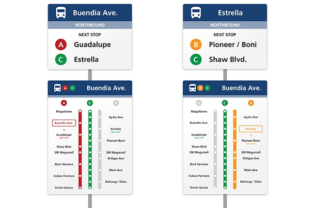
The revised stop signs utilize a white background and a navy blue color for the bus icon. The letter categories for the buses are available in bright colors for visibility, and are now on the print itself and not just a sticker. The “next stop” signs under it are modular, meaning they are removable.
Maps
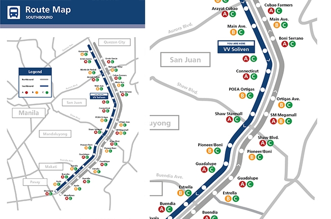
Compared to the typical bus directory, which shows the routes, the proposal now uses a dot-system, similar to what you will see in trains. A more detailed Route Map is available so you can view the approximate distance between the stops and major roads. They suggest a new Local Area Map which shows nearby establishments, perfect for those who frequently meet up at certain shops near the highway.
Bus Stickers
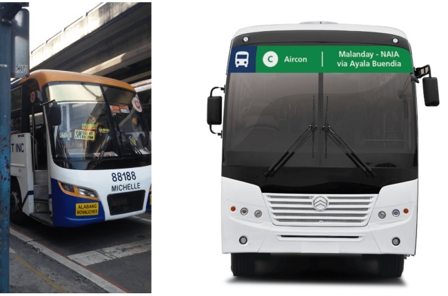
Aside from redesigning the stops signs and maps, they are also proposing for better bus signage/stickers. Instead of using route cards, they will add a sticker denoting details such as the bus route, bus letter and vehicle classification.
The sides of the bus will also have the same concept, only it spans across its entire length. Its color is the same as the bus’s category, so commuters can see even from a distance if the ride is worth running for.
Overall, this is a great concept that would make navigating throughout EDSA a lot easier. We just hope this gets to the concerned authorities so they can talk about improvement and implementation. If considered, this would be a good step towards better public transport.
Latest News
-
Isuzu Philippines officially launches the 2025 mu-X / News
The 2025 mu-X has finally landed in the Philippines! Let’s dive into what Isuzu has changed for its SUV.
-
Hyundai teases sporty IONIQ 6 N ahead of launch / News
Hyundai has confirmed that the IONIQ 6 N is on the way. A quick teaser was shown at the 2025 Seoul Mobility Show, giving fans a small look at what’s coming. It’s expected to be a more powerf...
-
MIAS 2025: Celebrating two decades of automotive greatness / News
With MIAS 2025 just days away, let’s take a look at how far this automotive event has come and what to look forward to.
Popular Articles
-
Cheapest cars under P700,000 in the Philippines
Jerome Tresvalles · Sep 02, 2024
-
First car or next car, the Ford EcoSport is a tough package to beat
Jun 18, 2021
-
Car Maintenance checklist and guide – here’s everything you need to know
Earl Lee · Jan 12, 2021
-
Most fuel efficient family cars in the Philippines
Bryan Aaron Rivera · Nov 27, 2020
-
2021 Geely Okavango — Everything you need to know
Joey Deriquito · Nov 19, 2020
-
Family cars in the Philippines with the biggest trunks
Sep 20, 2023
-
Head to head: Toyota Rush vs. Suzuki XL7
Joey Deriquito · Oct 28, 2020
-
Why oil changes are important for your car
Earl Lee · Nov 10, 2020
-
2021 Kia Stonic — What you need to know about it
Joey Deriquito · Oct 16, 2020
-
Top 7 tips for buying a used car in the Philippines
Joey Deriquito · Nov 26, 2020


